How To Make a Graph With Google Docs: An Ultimate Guide to Avoid Pitfalls
Creating visually appealing graphs can significantly enhance the clarity of data-driven discussions. Google Docs, combined with Google Sheets, provides a seamless way for businesses to create robust visual representations of their data. This guide will walk you through the entire process of making a graph in Google Docs, offering tips and insights tailored for large organizations. Whether you are preparing a report for stakeholders or presenting to a board, this step-by-step manual will ensure your graphs are not only informative but also aesthetically pleasing.
Understanding the Basics of Google Docs for Graphs
Google Docs is a versatile tool widely used for document creation and collaboration. However, its true potential is often unlocked when used in conjunction with Google Sheets, especially for creating graphs. Familiarity with both platforms can elevate your ability to present data clearly. Google Docs allows users to create well-structured reports, while Google Sheets serves as a powerful spreadsheet application that can handle complex data manipulation. Understanding the integration between the two is essential for effective data visualization.
Before diving into graph creation, it’s important to recognize the functionalities of Google Docs that enhance your reporting. The platform supports various editing features like text formatting, commenting, and collaboration, enabling teams to work together seamlessly. Knowing how to navigate these features can save time and ensure that your data presentation aligns with corporate branding guidelines. In a business environment, where clarity and precision are paramount, having a solid grip on these tools can lead to more impactful presentations.
Moreover, Google Docs offers cloud storage, allowing for real-time updates and multiple access points. This is crucial for organizations that may have teams working remotely or in different locations. The ability to collaborate and share insights instantly can lead to quicker decision-making processes. Understanding these basics lays the foundation for using graphs effectively within your documents, enhancing both your reports and presentations.
Setting Up Your Google Docs Document Efficiently
When preparing to create a graph in Google Docs, the first step is to set up your document efficiently. Start by opening a new Google Docs file and choosing a template that suits the purpose of your report. Google Docs provides a variety of templates that can help streamline the formatting process. Selecting a relevant template can save you time, allowing you to focus on your content rather than document layout.
Once your document is set up, consider organizing your content into sections. A well-structured document not only improves readability but also enhances the overall effectiveness of your report. Use headings, subheadings, and bullet points to break down complex information. This approach not only helps in organizing your thoughts but also makes it easier for your audience to absorb the information presented.
Another important aspect of setting up your document is the inclusion of relevant context for the graphs you plan to create. Providing accompanying text that explains the data and its significance can enrich your report. This context ensures that your audience understands the relevance of the graphs and can make informed interpretations. By combining thoughtful document structure with informative content, you set the stage for an impactful data presentation.
Accessing the Google Sheets Integration for Graphs
To create effective graphs, you need to access Google Sheets, where the actual data manipulation takes place. Start by opening Google Sheets and creating a new spreadsheet. Input your data in a structured manner, using rows and columns to categorize information clearly. A well-organized data table is essential for generating accurate graphs, so take the time to ensure your data is complete and correctly formatted.
Once your data is ready, you can easily integrate it into Google Docs. Google Sheets provides an option to insert charts directly into your document, thereby creating a seamless link between your data and its visual representation. This integration is particularly advantageous for large organizations where data is often managed by different teams. Collaborating on a single spreadsheet reduces the risk of inconsistencies and errors in the reporting process.
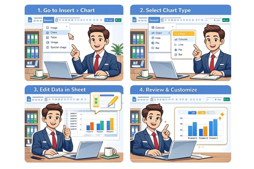
To access the integration, simply select the data you wish to visualize in Google Sheets and click on the “Insert” tab, then choose “Chart.” This will open a new window where you can customize your graph based on your data selection. The integration between Google Sheets and Google Docs ensures that any updates made to the spreadsheet will automatically reflect in your document, making your reporting dynamic and up-to-date.
Choosing the Right Type of Graph for Your Data
Selecting the appropriate type of graph is critical for effectively conveying your message. Different data sets lend themselves to various forms of representation. For instance, line graphs are excellent for depicting trends over time, while bar graphs are ideal for comparing quantities across different categories. Understanding the nature of your data is key to making an informed choice about the type of graph to use.
Consider your audience when selecting a graph type. In a corporate context, stakeholders may prefer straightforward visuals that quickly communicate data insights. Simplistic pie charts can break down proportions effectively, while scatter plots can illustrate correlations between variables. Choosing a graph type that resonates with your audience will enhance their understanding and retention of the information you present.
Additionally, think about the story you want to tell with your data. Each graph type has its strengths and weaknesses. For example, while a pie chart may effectively convey percentages, it can become cluttered if too many segments are included. In contrast, a bar graph can accommodate more categories without sacrificing clarity. By aligning your graph choice with your data’s narrative, you can create visuals that not only inform but also engage your audience.
Inputting Data in Google Sheets for Your Graph
With your graph type selected, it’s time to input data into Google Sheets. Start by creating clear headers for your columns, ensuring that each represents a specific variable. This organization will facilitate the graph creation process later on. Enter data in a logical manner; for instance, if you are tracking sales over several months, list the months in one column and their corresponding sales figures in the adjacent column.
As you’re inputting data, consider the importance of accuracy and consistency. Large organizations often rely on data to inform strategic decisions, so ensuring the integrity of your information is essential. Double-check your figures, and if necessary, utilize Google Sheets’ built-in formulas to automate calculations. This not only speeds up the process but also minimizes potential human errors.
Once your data is securely in place, you can begin to visualize it. Highlight the relevant cells and utilize Google Sheets’ chart creation tools to generate a preliminary graph. This initial version can act as a draft, giving you the opportunity to see how your data translates into a visual format. If adjustments are needed, returning to the data input phase allows for easy corrections without starting from scratch.
Customizing Your Graph’s Appearance and Style
After creating a basic graph, the next step is customization. Google Sheets allows you to modify various elements of your graph, including colors, labels, and legends. Customizing these aspects can significantly enhance the clarity and appeal of your visual. For example, using your company’s color palette can create a cohesive brand identity across your reports.
Consider adding data labels to your graph, which can provide additional context for viewers. Data labels help your audience to quickly grasp important figures without having to reference the data table. Additionally, adjusting the axis titles can clarify what each axis represents, which is particularly important in more complex graphs where the audience may not be as familiar with the data.
Lastly, take advantage of Google Sheets’ various chart styles. Experimenting with different layouts can often reveal a graph that best conveys the story behind your data. A well-styled graph not only looks professional but can also capture the attention of your audience, making your report more engaging. By investing time in customization, you can optimize the effectiveness of your graph within the larger context of your report.
Inserting Your Graph into Google Docs Seamlessly
Once your graph is customized to your satisfaction, it’s time to insert it into Google Docs. This process is straightforward thanks to the integration between Google Sheets and Google Docs. In Google Sheets, click on your graph to select it, then use the “Copy” function. After that, navigate to your Google Docs document and click where you want the graph to appear. Use the “Paste” function to insert your graph into the document.
Upon pasting, a prompt may appear asking whether you want to link the graph to the spreadsheet. Opting for this link is beneficial, as it ensures that any future updates made in Google Sheets will automatically reflect in your Google Docs report. This dynamic linkage is especially useful for ongoing projects where data is frequently updated, providing your stakeholders with the most current information without manual adjustments.
After insertion, take a moment to reposition and resize your graph for better visual integration within the document. Ensure that it complements your text rather than overwhelms it. Properly formatted graphs can significantly enhance the overall professionalism of your report, allowing your audience to focus on the information without distractions.
Tips for Presenting Your Graph Effectively in Reports
Effective presentation is key to ensuring that your graphs resonate with your audience. Start by providing context around the graph. Briefly explain what the data represents and why it’s relevant to the overall report. This can include highlighting significant trends, outliers, or patterns that may not be immediately obvious from the data alone. Providing this context can facilitate a deeper understanding and engagement from your audience.
Consider the placement of your graph within the document. Ideally, graphs should be positioned close to the text that discusses them. This proximity helps maintain a logical flow and allows your audience to see the connection between the visual data and the accompanying narrative. Using captions can further enhance understanding, as they summarize the key takeaways from the graph.
Finally, encourage feedback from your audience. In a corporate setting, engaging stakeholders in discussion can lead to valuable insights and perspectives. Solicit their thoughts on the graph’s clarity and effectiveness. This not only opens the door for collaboration but also fosters a culture of continuous improvement, where data-driven decision-making becomes a collective effort.
Conclusion – How To Make a Graph With Google Docs
In conclusion, creating graphs in Google Docs using Google Sheets is a powerful way to visualize data in a corporate setting. By following the steps outlined in this guide, you can effectively transform complex datasets into compelling visuals that enhance your reports. Remember, clarity and customization are key to making your graphs stand out. With practice, you will become adept at using these tools to communicate insights effectively, driving informed decision-making across your organization.
Hashtags: #GoogleDocs #DataVisualization #BusinessIntelligence #GraphCreation #CorporateReporting
External Source: For more tips on how to create a graph n google docs visit Google