How Do I Make a Pareto Chart in Excel: A Practical Guide for Excel Users
In today’s data-driven world, the ability to visualize information effectively can lead to better decision-making and strategic insights. One such powerful tool is the Pareto chart, which helps prioritize issues based on their significance. This article will guide you through the steps to create a Pareto chart in Excel, ensuring you understand its relevance and application in a corporate setting. Whether you’re dealing with customer complaints, production delays, or quality control, mastering this chart can enhance your analytical capabilities and improve business outcomes.
Understanding the Basics of Pareto Charts in Excel
Pareto charts are named after the Italian economist Vilfredo Pareto, who introduced the 80/20 rule, suggesting that 80% of effects come from 20% of causes. In business, this principle is often used to identify the most significant factors contributing to problems. By highlighting the most impactful issues, organizations can focus their resources and efforts effectively, leading to improved results. A Pareto chart combines a bar graph and a line graph, with bars representing individual categories and a line indicating the cumulative percentage.
In Excel, creating a Pareto chart allows you to visualize data trends quickly. The left axis shows the frequency or cost of problems, while the right axis shows the cumulative percentage. This dual-axis format assists in identifying which factors are most critical to address, thereby facilitating better resource allocation. The key to using Pareto charts effectively lies in understanding your data and ensuring that the categories you represent are relevant to your analysis.
Moreover, the visual nature of Pareto charts makes them an excellent tool for presentations and reports. They can communicate complex data in a simplified manner, allowing stakeholders to grasp essential insights quickly. The ability to illustrate significant discrepancies in data effectively can foster more informed discussions and prompt actionable decisions, making Pareto charts a staple in the toolkit of data analysts and business leaders alike.
Steps to Prepare Your Data for Chart Creation
Before diving into creating a Pareto chart, it’s crucial to prepare your data properly. Start by collecting relevant data that reflects the issues you want to analyze. This could be customer complaints, defect rates, or any other measurable category. Ensure that your data is categorized appropriately, as this will directly impact the chart’s effectiveness. For instance, grouping complaints by type will help you visualize which types are most frequent or costly.
Next, organize your data in Excel. Use a simple table format, with one column for categories and another for their corresponding values. It’s important to ensure that the values are numerical, as this will allow the chart to depict meaningful comparisons. Sorting the data in descending order based on the values will facilitate the identification of the most significant contributors when creating the chart.
After your table is set up, you may also want to calculate the cumulative totals and percentages for your data. This step involves summing the values as you move down the list and then calculating the percentage of the total that each category represents. This information is essential for the right axis of the Pareto chart and will provide a clearer understanding of the cumulative impact of the issues you are analyzing.
How to Create a Pareto Chart Using Excel Tools
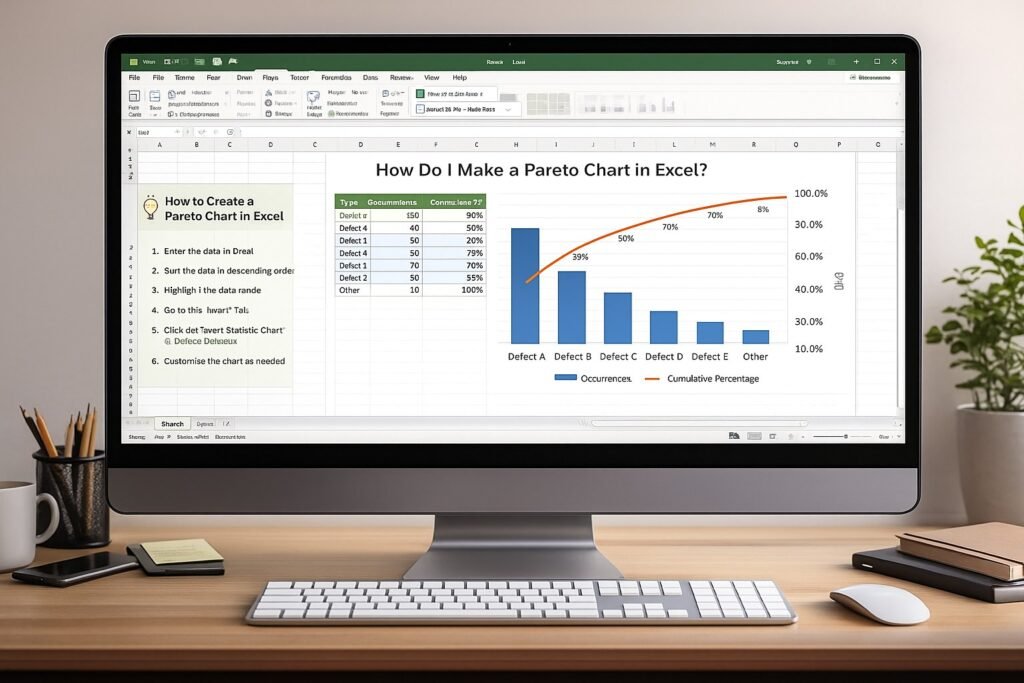
Once your data is prepared, you can begin creating your Pareto chart in Excel. Start by selecting your data table, including both the categories and values. Navigate to the “Insert” tab on the ribbon and look for the “Charts” section. Click on “Insert Statistic Chart,” and then select “Pareto.” Excel will automatically create a Pareto chart based on the selected data, displaying the bars and line graph on the same chart.
After inserting the chart, you might notice that Excel arranges the categories based on frequency by default. This arrangement is typically effective, but you can always customize it further. Right-click on the chart elements to access formatting options that allow you to adjust colors, styles, and labels. A well-organized chart will enhance readability and make it easier for stakeholders to interpret the data.
Finally, it’s important to check that your cumulative line is represented correctly. Ensure that it starts from the first bar and accurately reflects the cumulative percentages. You can do this by right-clicking the line, selecting “Format Data Series,” and confirming the data range. Once everything looks good, you have successfully created your Pareto chart, ready to be used for further analysis.
Customizing Your Pareto Chart for Visual Clarity
A well-designed Pareto chart can significantly enhance its effectiveness in conveying information. Start by customizing the chart title to reflect the specific issue you are analyzing. Instead of a generic title, opt for something descriptive that will clarify the focus of the analysis, such as “Top Customer Complaints by Frequency.” This can make a notable difference in how quickly your audience grasps the intent of the chart.
Next, consider adjusting the colors of the bars, especially if you have multiple categories. Using distinct colors for different categories can help differentiate them, adding visual appeal to the chart. It’s also wise to use a muted color for the cumulative line, allowing the bars to take center stage. Ensuring that the chart maintains a clean and professional appearance is critical, particularly when presenting to stakeholders.
Additionally, you might want to incorporate data labels to provide precise values at the top of each bar. This can help your audience quickly assess the significance of each category without having to refer back to the data table. You can add data labels by right-clicking on the bars and selecting “Add Data Labels.” With these customizations, your Pareto chart will not only be visually appealing but also informative, making it an effective communication tool.
Analyzing Trends and Insights from Your Chart
After successfully creating and customizing your Pareto chart, it’s time to analyze the results. The first step is to identify the categories that represent the most significant issues. Typically, the first few bars will account for the majority of the overall issues, aligning well with the 80/20 rule. By focusing on these critical areas, you can prioritize where to direct team efforts and resources.
Next, examine the cumulative percentage line to gauge how quickly you reach the 80% threshold. If several categories contribute minimally to the overall total, they may warrant less attention. This insight is invaluable for strategic planning, allowing you to allocate resources more effectively, whether this means reducing complaints, addressing defects, or improving service delivery.
Finally, consider how these insights can drive action. For instance, if a particular type of complaint dominates the chart, you can initiate targeted quality improvements or customer service training to address it. The analysis done through the Pareto chart can serve as a foundation for more in-depth investigations into the underlying causes of these issues, leading to long-term improvements and enhanced customer satisfaction.
Common Mistakes When Making Pareto Charts
While creating a Pareto chart in Excel can be straightforward, several common mistakes can undermine the chart’s effectiveness. One prevalent issue is selecting inappropriate data categories. If the categories do not adequately reflect the issues being analyzed, the chart’s insights will be misleading. For example, grouping unrelated complaints together can obscure the true nature of customer dissatisfaction.
Another frequent mistake is failing to sort the data correctly. The bars must be arranged in descending order based on their values for the chart to illustrate the most significant issues clearly. If you neglect this step, the chart may not accurately represent the priority order, leading to misguided conclusions and ineffective decision-making.
Lastly, overcomplicating the chart can detract from its purpose. Including too many categories can clutter the visual and make it difficult to discern patterns. It’s essential to strike a balance between comprehensiveness and clarity. By focusing on the most impactful issues and maintaining a clean design, your Pareto chart will be a more effective tool for analysis and communication.
Practical Applications of Pareto Charts in Business
Pareto charts are versatile tools that can be applied in various business contexts. One common application is in quality control processes. By analyzing defect types in manufacturing, organizations can pinpoint the most frequent issues, allowing them to focus on quality improvements that will yield the most significant benefits. For instance, if a specific defect type consistently appears in the top categories, teams can prioritize corrective actions to reduce overall defect rates.
Customer service departments also benefit from Pareto charts. By tracking customer complaints, organizations can identify recurring issues, whether related to service quality, product reliability, or support responsiveness. Once identified, focused training or process changes can address these key issues, improving customer satisfaction and loyalty over time.
Furthermore, Pareto charts can guide marketing strategies by helping teams understand which products or services generate the most complaints or returns. This data can inform product development decisions or marketing messaging, ensuring that efforts are directed toward the areas with the most impact. In a competitive business environment, the ability to analyze data effectively can provide a strategic edge.
Tips for Presenting Your Pareto Chart Effectively
When it comes to presenting your Pareto chart, clarity and engagement are key. Start by introducing the chart’s purpose and its significance to the audience. Explain the 80/20 rule briefly, as it provides valuable context for understanding the chart’s insights. This can set the stage for a more meaningful discussion and help the audience grasp the importance of the data being presented.
During the presentation, highlight the most critical bars and the cumulative line. Use your mouse cursor or a pointer to draw attention to these elements, allowing the audience to follow along easily. Engaging storytelling can enhance comprehension; consider sharing relevant anecdotes or examples that illustrate the implications of the data.
Finally, encourage interaction by inviting questions or discussions about the findings. Engaging your audience can lead to valuable insights and collaborative problem-solving. By preparing to address questions regarding the data and the implications behind the chart, you can foster a more dynamic and productive discussion, ultimately enabling better decision-making based on the insights derived from your Pareto chart.
Creating a Pareto chart in Excel is a straightforward process that can yield powerful insights for any business. By understanding the fundamentals, preparing your data accurately, and customizing your chart for visual clarity, you can harness the power of this analytical tool. With the ability to analyze and present data effectively, you can prioritize issues and drive improvements in your organization. Whether you are addressing customer concerns or enhancing operational efficiencies, a Pareto chart can be invaluable in guiding your strategic decisions.
Below is a detailed, enterprise-focused FAQ section using H3 headings, written to be SEO-friendly, instructional, and aligned with corporate analytics and decision-making contexts.
What Is a Pareto Chart and Why Is It Used in Business?
A Pareto chart is a data visualization tool that helps organizations identify the most significant factors contributing to a problem. Based on the 80/20 principle, it shows which causes create the greatest impact. In corporate environments, Pareto charts are commonly used to prioritize quality issues, operational risks, customer complaints, and cost drivers.
Why Should I Use a Pareto Chart in Excel?
Excel is widely adopted across enterprises for data analysis and reporting. Creating a Pareto chart in Excel allows teams to quickly analyze data without specialized software. It supports transparency, repeatability, and executive-ready reporting while enabling analysts to link insights directly to existing datasets.
What Types of Business Problems Can Pareto Charts Help Solve?
Pareto charts are effective for analyzing:
-
Customer complaints and service issues
-
Production defects and quality failures
-
Operational delays and bottlenecks
-
Cost overruns and expense categories
-
Risk events and incident frequency
They help organizations focus improvement efforts where they deliver the greatest value.
What Data Do I Need to Create a Pareto Chart in Excel?
To build a Pareto chart, you need:
-
A list of categories (for example, defect types or complaint reasons)
-
A numerical value for each category, such as frequency, cost, or impact
Accurate and well-categorized data is critical, as poor data quality will undermine the insights the chart provides.
How Do I Prepare Data Before Creating a Pareto Chart?
Data preparation includes:
-
Cleaning duplicates and inconsistencies
-
Grouping similar issues into meaningful categories
-
Sorting categories in descending order by impact
-
Calculating cumulative totals and percentages
These steps ensure the Pareto chart accurately reflects business reality.
How Does Excel Display a Pareto Chart?
A Pareto chart in Excel combines:
-
A bar chart showing individual category values
-
A line graph showing the cumulative percentage
The left axis displays frequency or cost, while the right axis displays cumulative percentage, allowing users to identify the “vital few” contributors quickly.
Which Excel Versions Support Pareto Charts?
Modern versions of Excel, including Excel 2016 and later, offer built-in Pareto chart functionality. Earlier versions require manual creation using column charts and calculated cumulative percentages. Enterprises should standardize versions to ensure consistent reporting.
How Do Pareto Charts Support Executive Decision-Making?
Pareto charts translate raw data into clear priorities. Executives can quickly see which issues require attention, enabling faster decisions on resource allocation, risk mitigation, and improvement initiatives. This makes Pareto charts ideal for dashboards, steering committees, and governance reviews.
How Can Pareto Charts Improve Process Improvement Initiatives?
By identifying the most impactful causes of problems, Pareto charts help organizations target corrective actions effectively. This supports continuous improvement methodologies such as Lean, Six Sigma, and operational excellence programs by focusing effort on high-value interventions.
What Are Common Mistakes When Creating Pareto Charts in Excel?
Common mistakes include:
-
Using too many categories, which reduces clarity
-
Failing to sort data correctly
-
Ignoring cumulative percentage calculations
-
Using inconsistent or poor-quality data
Avoiding these errors ensures the chart remains accurate and actionable.
Can Pareto Charts Be Used for Risk Management?
Yes. Pareto charts are frequently used to analyze risk events, compliance issues, and incident trends. They help risk teams prioritize controls and mitigation actions based on frequency or impact, improving governance and assurance outcomes.
How Often Should Pareto Charts Be Updated?
In enterprise environments, Pareto charts should be updated regularly—monthly, quarterly, or per reporting cycle—depending on the use case. Regular updates ensure that decisions are based on current data rather than historical assumptions.
Are Pareto Charts Suitable for Presentations and Reports?
Yes. Pareto charts are highly effective for presentations because they simplify complex data into an easy-to-understand visual. They are commonly used in executive reports, operational reviews, and stakeholder briefings.
How Do Pareto Charts Complement Other Excel Analysis Tools?
Pareto charts work well alongside pivot tables, dashboards, control charts, and KPI reports. Together, these tools provide both high-level insight and detailed analysis, supporting informed and defensible business decisions.
When Should I Avoid Using a Pareto Chart?
Pareto charts are less effective when:
-
Data categories are not comparable
-
Issues have equal impact
-
Root causes are unclear or poorly defined
In such cases, alternative analytical methods may be more appropriate.
Conclusion – How Do I Make a Pareto Chart in Excel
Pareto charts are a powerful yet practical tool for transforming raw data into clear, actionable insight. In a corporate environment where time, resources, and attention are limited, the ability to identify the most significant drivers of problems is essential. By applying the Pareto principle through Excel, organizations can move beyond intuition and anecdotal evidence toward structured, data-driven decision-making.
Understanding how to create a Pareto chart in Excel enables professionals to prioritize issues based on measurable impact rather than volume alone. Whether addressing customer complaints, quality defects, operational delays, or cost overruns, Pareto analysis helps teams focus on the “vital few” causes that deliver the greatest opportunity for improvement. This targeted approach improves efficiency, supports continuous improvement initiatives, and strengthens governance by ensuring decisions are grounded in evidence.
From an enterprise perspective, Pareto charts also play an important role in communication and accountability. Their visual clarity makes them ideal for executive reporting, stakeholder presentations, and cross-functional discussions. When used consistently, they establish a common language for prioritization and performance management, reducing ambiguity and aligning teams around shared objectives.
Ultimately, mastering Pareto charts in Excel is not just a technical skill but a strategic capability. Organizations that embed Pareto analysis into their reporting and improvement frameworks gain greater control over risk, cost, and quality outcomes. By routinely applying this method, enterprises can ensure that effort and investment are directed where they generate the highest value, driving sustainable improvement and stronger business results over time.
Hashtags: #ParetoChart #DataAnalysis #ExcelTips #BusinessInsights #QualityControl
External Source: For a deeper understanding of the Pareto principle, visit the American Society for Quality at https://asq.org/quality-resources/pareto.