Service Delivery Project Dashboards That Monitor Progress Effectively
Effective project dashboards are crucial for service delivery, allowing organizations to monitor progress and performance seamlessly. In a world where data drives decision-making, leveraging dashboards can enhance transparency, accountability, and efficiency. This article explores the nuances of creating Service Delivery Project Dashboards That Monitor Progress Effectively but also align with broader business objectives.
Understanding the Importance of Project Dashboards in Service Delivery
In the realm of service delivery, project dashboards serve as vital tools that centralize data visualization and reporting. They provide stakeholders with a clear overview of project status, resources, and timelines. The ability to visualize complex data sets in real-time fosters a culture of transparency, allowing team members and executives alike to stay informed about critical developments. When everyone has access to the same information, it enhances collaboration and minimizes misunderstandings that can derail projects.
Additionally, project dashboards facilitate proactive decision-making. In large organizations, where multiple teams work concurrently on various initiatives, having a consolidated view of project metrics becomes essential. Dashboards highlight areas needing attention, such as delays in project timelines or budget overruns. By pinpointing these issues early, teams can formulate corrective actions, ultimately leading to improved service delivery outcomes.
Moreover, the adaptability of dashboards is noteworthy. They can evolve as project requirements change, accommodating new metrics or visualizations as necessary. This flexibility ensures that the dashboard remains relevant, allowing organizations to maintain a pulse on project health while responding to dynamic business environments.
Key Features of Effective Project Dashboards for Monitoring
An effective project dashboard is characterized by several key features that enhance its usability and effectiveness. First and foremost, clarity is critical. A well-designed dashboard should present information in an intuitive format, utilizing graphs, charts, and color coding to convey complex data clearly. This visual representation helps stakeholders quickly grasp the project’s status without getting bogged down by unnecessary details.
Another essential feature is interactivity. Users should be able to drill down into the data for more granular insights. For instance, clicking on a specific metric might reveal underlying data trends, historical comparisons, or performance forecasts. This level of interaction empowers teams to explore the details behind high-level summaries, facilitating deeper understanding and better-informed decision-making.
Lastly, customizable dashboards are invaluable. Different stakeholders require varying types of information. For example, executives may seek high-level performance indicators, while project managers might need detailed operational metrics. A dashboard that allows for user customization can cater to these diverse needs, ensuring that everyone involved has the insights they require to perform at their best.
Designing Dashboards That Align with Business Objectives
When designing project dashboards, aligning them with overarching business objectives becomes paramount. This alignment not only ensures that the dashboard remains relevant but also enhances its strategic value. Before creating a dashboard, organizations should clearly outline their business goals and identify the key performance indicators (KPIs) that will measure success. A dashboard that tracks metrics aligned with strategic objectives can help ensure that every project contributes to the company’s mission.
Moreover, involving stakeholders in the design process can significantly enhance dashboard effectiveness. Gathering input from various departments can shed light on the metrics that matter most to different teams. By understanding diverse perspectives, organizations can create dashboards that resonate with their stakeholders, driving greater engagement and usage. It also fosters a sense of ownership, ensuring that teams are more likely to rely on the dashboard as a central tool for progress monitoring.
Finally, incorporating a feedback loop into the dashboard design process can enhance ongoing usability. After the initial rollout, organizations should actively seek user feedback to make continuous improvements. This iterative approach allows dashboards to evolve in response to user needs and changing business landscapes, maximizing their utility over time.
Metrics That Matter: Tracking Progress and Performance
Identifying the right metrics is crucial for effective project monitoring through dashboards. These metrics should not only reflect project progress but also offer insights into performance and resource allocation. Common metrics include project timelines, budget utilization, and team productivity. By tracking these indicators, organizations can assess if they are on track to meet their service delivery commitments.
Additionally, customer satisfaction metrics are vital. Tracking user feedback and service quality can provide organizations with a holistic view of how well they are performing against customer expectations. Incorporating Net Promoter Scores (NPS) or customer satisfaction scores (CSAT) can help organizations understand the impact of their service delivery efforts. High levels of customer satisfaction often correlate with successful project execution, reinforcing the importance of monitoring these metrics closely.
Lastly, organizations should not overlook leading indicators. These are metrics that can predict future performance, such as employee engagement levels or turnaround times for specific tasks. By monitoring these indicators, teams can anticipate potential challenges and make proactive adjustments, ensuring that they remain aligned with business objectives and deliver value effectively.
Real-Time Data Visualization for Enhanced Decision-Making
Real-time data visualization is a game-changer in monitoring project progress. Unlike traditional reporting methods that present historical data, real-time dashboards enable organizations to view live updates on project statuses. This immediacy allows decision-makers to respond swiftly to emerging issues, optimizing resource allocation and strategic planning.
Furthermore, real-time data visualization enhances collaboration among teams. With stakeholders able to access up-to-date information at any time, it fosters a shared understanding of project dynamics. Such transparency can break down silos within organizations, encouraging cross-departmental collaboration. Teams can work more cohesively toward common goals, ultimately improving service delivery outcomes.
Moreover, the ability to visualize data in various formats—such as graphs, heat maps, or trend lines—can uncover insights that would otherwise remain hidden in static reports. By displaying information visually, teams can spot trends, anomalies, and correlations more easily, leading to more informed decision-making. This enhanced visibility is particularly crucial in fast-paced environments where agile responses are necessary to maintain project momentum.
Customizing Dashboards for Different Stakeholder Needs
Customizing dashboards for different stakeholders is essential for maximizing engagement and relevance. Different roles within an organization have distinct information needs. For instance, executives may prioritize high-level overview metrics, while project managers might require detailed task completion rates and resource allocations. Creating tailored dashboards allows organizations to meet these diverse needs efficiently.
Implementing user-friendly filters and settings can facilitate customization. Stakeholders should be able to adjust their dashboards to focus on the metrics that matter most to them. This level of personalization can significantly improve the user experience, making it more likely that stakeholders will utilize the dashboard regularly. User-friendly design features should include drag-and-drop functionalities, customizable widgets, and the ability to save personalized views.
Moreover, fostering a culture of data literacy among stakeholders can enhance the effectiveness of dashboards. Providing training sessions or resources can empower users to make the most of their customized dashboards. When stakeholders understand how to interpret and act on the data presented, they are more likely to contribute to project success actively.
Best Practices for Maintaining and Updating Dashboards
Maintaining and updating dashboards is just as important as the initial design. Regularly reviewing dashboard performance ensures that it continues to meet user needs and remains aligned with business objectives. Organizations should schedule routine assessments to evaluate the relevance of metrics, visualizations, and overall usability. This proactive approach can help identify potential issues before they impact service delivery.
Additionally, organizations should establish clear ownership. Designating a team or individual responsible for dashboard management ensures accountability. This responsibility includes not only updating data but also gathering user feedback, implementing improvements, and addressing any technical issues. A dedicated point of contact can streamline the maintenance process, ensuring that the dashboard remains a reliable resource for all stakeholders.
Lastly, leveraging technology can aid in the ongoing maintenance of dashboards. Many dashboard tools offer automated updates and alerts for specific metrics, which can alleviate the manual workload. Utilizing these features allows organizations to focus on analysis and decision-making rather than data entry, making dashboard management more efficient.
Case Studies: Successful Implementation of Project Dashboards
Examining successful case studies can provide valuable insights into effective project dashboard implementation. One notable example comes from a large healthcare organization that faced challenges in tracking patient outcomes across multiple service lines. By implementing a centralized project dashboard, the organization gained visibility into key performance metrics, such as patient satisfaction scores and treatment times. As a result, they identified areas for improvement, leading to enhanced patient care and operational efficiency.
Another case study involves a technology company that struggled with project delays due to insufficient tracking of resource allocations. By deploying an interactive project dashboard that visualized resource utilization, the company was able to identify bottlenecks and redistribute workloads effectively. This proactive approach not only improved project timelines but also increased team morale by reducing burnout and frustration.
Finally, a governmental agency sought to improve transparency and accountability in public service delivery. By creating a public-facing project dashboard that displayed real-time progress on various initiatives, they enhanced citizen engagement and trust. The dashboard allowed stakeholders to monitor project statuses and provide feedback, fostering a collaborative approach to governance. These case studies underscore the transformative potential of project dashboards in diverse organizational contexts.
Frequently Asked Questions
What is a service delivery project dashboard?
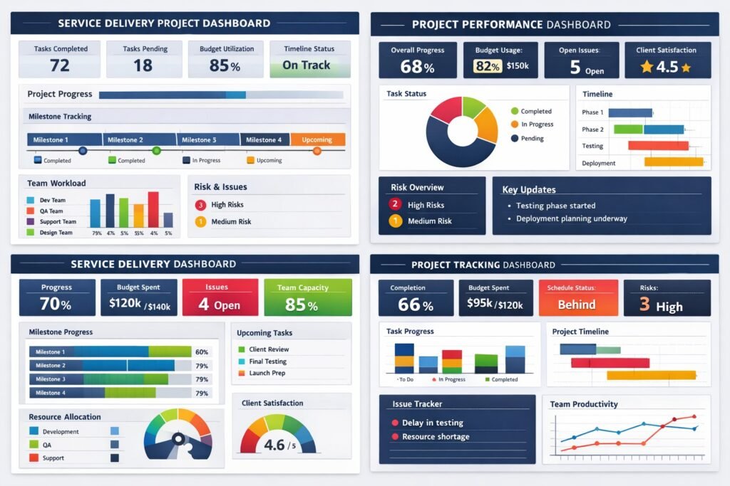
A service delivery project dashboard is a centralized visual reporting tool that displays key performance indicators, milestones, risks, and progress metrics related to service delivery initiatives. It provides leadership and delivery teams with a real-time view of project health and operational performance.
Why are project dashboards important for service delivery?
Dashboards are essential because they transform raw data into actionable insights. They improve transparency, enable faster decision-making, and help organizations identify issues early, such as delivery delays or resource constraints, before they impact customers or contractual commitments.
Who should use service delivery project dashboards?
Project dashboards are designed for multiple audiences. Executives use them for strategic oversight, service delivery managers rely on them for operational control, and project teams use them to track progress, dependencies, and risks. A well-designed dashboard supports all these perspectives without creating confusion.
What metrics should be included in a service delivery dashboard?
Key metrics typically include schedule performance, budget utilization, resource capacity, service-level agreement performance, risk status, issue trends, and milestone completion. The exact metrics should align with organizational goals and service delivery priorities.
How do dashboards support proactive decision-making?
Dashboards surface trends and exceptions in real time. By highlighting variances, emerging risks, or performance dips, they enable leaders to intervene early, reallocate resources, or adjust priorities before issues escalate into delivery failures.
How often should project dashboards be updated?
Effective dashboards are updated frequently, ideally in real time or at least daily for critical delivery metrics. Regular updates ensure stakeholders are working from accurate information and prevent decisions based on outdated data.
Can dashboards be customized for different stakeholders?
Yes, customization is one of the most important features of an effective dashboard. Executives often require high-level summaries, while project managers need operational detail. Custom views ensure each stakeholder sees relevant insights without unnecessary complexity.
What makes a project dashboard effective rather than overwhelming?
Clarity, relevance, and focus define an effective dashboard. It should highlight what matters most, avoid excessive metrics, and use clear visuals. A dashboard that tries to show everything often ends up driving no action at all.
How do dashboards improve accountability in service delivery?
Dashboards make performance visible. When delivery metrics, risks, and ownership are clearly displayed, accountability increases naturally. Teams understand expectations, leaders can track commitments, and performance discussions become fact-based rather than subjective.
How do project dashboards align with business objectives?
When designed correctly, dashboards link project metrics directly to business outcomes such as customer satisfaction, operational efficiency, revenue protection, or regulatory compliance. This alignment ensures service delivery efforts support broader organizational strategy rather than operating in isolation.
Conclusion – Service Delivery Project Dashboards That Monitor Progress Effectively
In conclusion, service delivery project dashboards are indispensable tools for modern organizations aiming to monitor progress effectively. By emphasizing clarity, customization, and alignment with business objectives, these dashboards can drive better decision-making and enhance overall performance. As organizations continue to navigate complex landscapes, leveraging the power of dynamic dashboards will be key to achieving their strategic goals.
Hashtags: #ProjectDashboards #ServiceDelivery #DataVisualization #PerformanceMetrics #BusinessObjectives
Discover More great insights at www.pmresourcehub.com
Explore Free Project Management Templates https://pmresourcehub.com/library/
Explore Project dashboards for project‑delivery performance at WorkflowMax